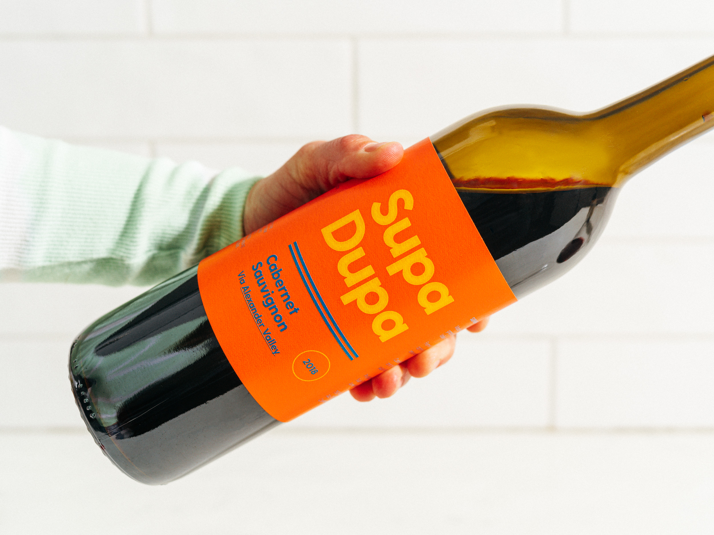
Sourced entirely from certified sustainable vineyards, Supa
Dupa is a series of three wines from Northern
California. The first to be produced is a classic expression of California Cabernet
Sauvignon from the Alexander Valley, and will soon be joined by a Pinot Noir and a Chardonnay. All part
of the same family, all approachable and down for a good time.
Project Scope:
Naming
Packaging Design
Naming
Packaging Design


Naming & Packaging Design
Occasionally a project comes along where we get to have all
the fun. Supa Dupa was one of them. Tasked with naming and packaging
design, we focused on the all-too-often disconnect between pricing and artwork. Why so fancy if you’re on the center table? Have
some fun, be different. After all, these are the wines that are most frequently
purchased on a whim, by a customer looking for a bottle that matches their mood. Enter: Supa Dupa, the Tuesday movie night or Saturday dinner, happy-go-lucky, confident and delicious bottle everyone wants.
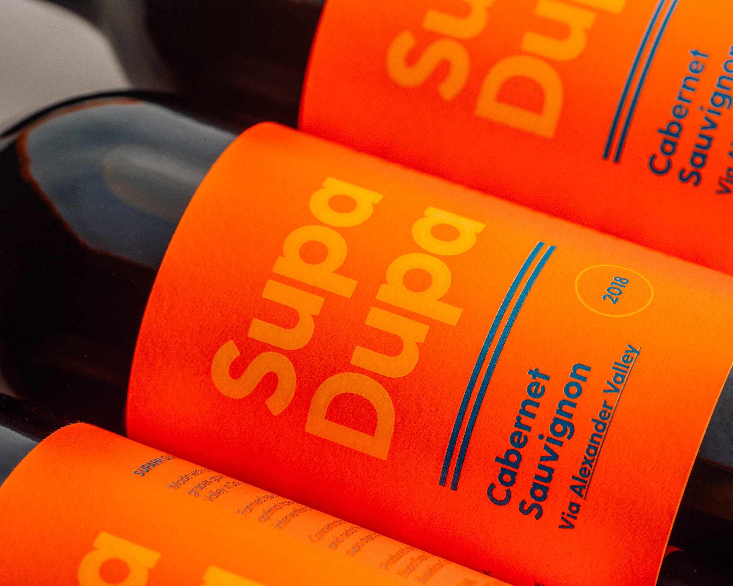
When it was time to start design, we knew we had a star of the show in such a flamboyant name. To ensure it was center stage and to keep things from going off the rails, we set out to create a label that stood out on a shelf while not overwhelming with artistry. The outcome is a poppy, clean and minimal design with large modern type. The label is intended to be replicable for a range of varietals using a consistent 4-color palette.
When it was time to start design, we knew we had a star of the show in such a flamboyant name. To ensure it was center stage and to keep things from going off the rails, we set out to create a label that stood out on a shelf while not overwhelming with artistry. The outcome is a poppy, clean and minimal design with large modern type. The label is intended to be replicable for a range of varietals using a consistent 4-color palette.
